
There are moose on the horizon and lots of them! :)
With the publication of 'Too Many Moose' around the corner I thought I'd put a little making of together for this book. So here's how this book written by the fab Lisa M. Bakos came together.
From the outset the book needed to start calmly and then descend into a lot of moosey chaos. I wanted to keep the illustration style bright, colourful and quite minimal in areas as the whole focus was on Martha and her ten moose. So the use of white space in the book was important and how I could keep the pages interesting but not overload them at the same time.
The first step was to come up with the moose character himself :

This is the first moose that Martha orders and so I wanted to keep him fairly plain and as normal looking as possible. As she orders more the various other moose have their own characteristics to separate them from each other. This moose design was successfully signed off so then I moved onto developing the cover for what was then the original title 'Mail Order Moose'

Initial moose thumbnails

Some early cover ideas. I had the thought of using letters and envelopes as a border to frame the two main characters.

This set of cover ideas were moving in the direction the publisher wanted however and we decided to go with number two.
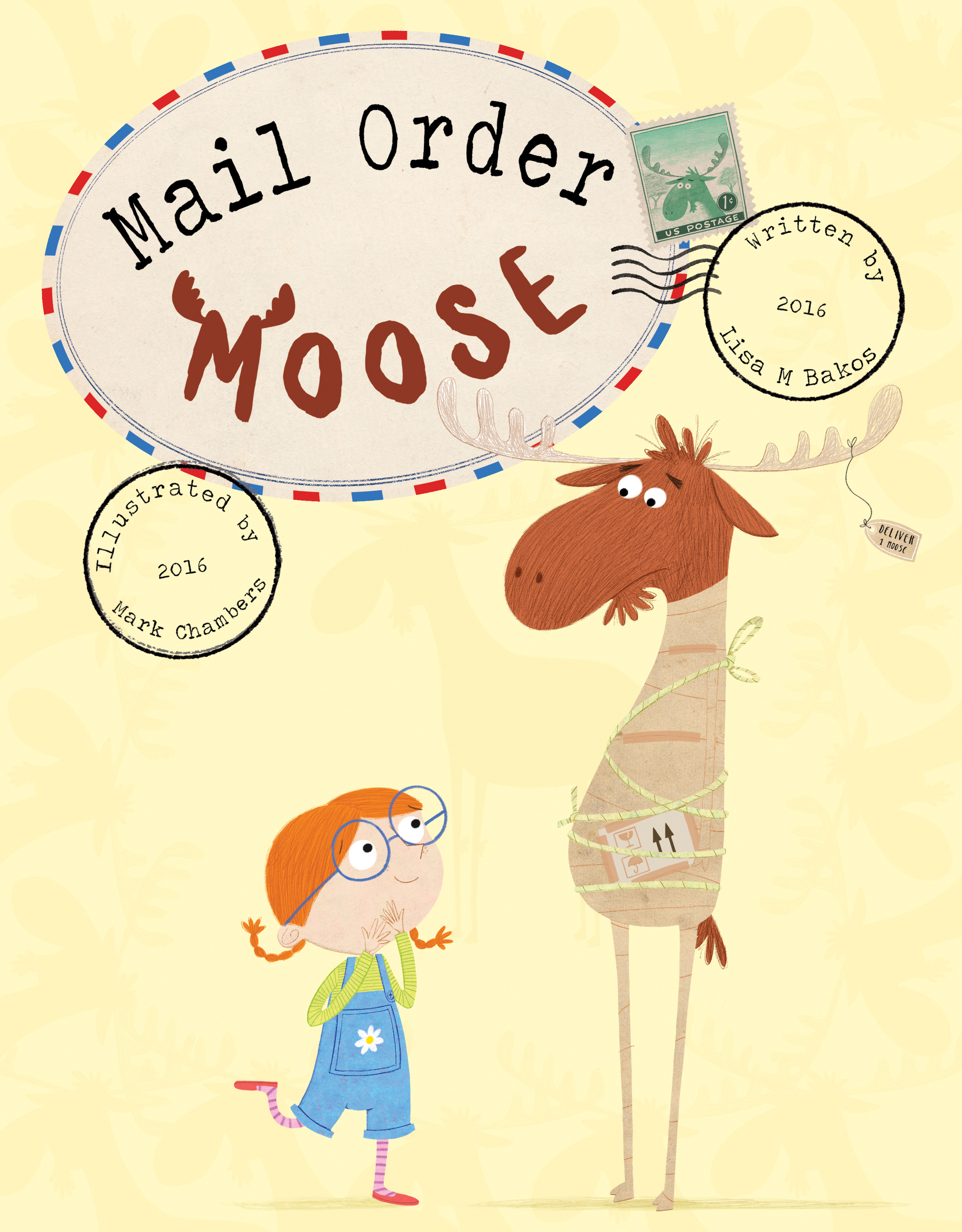
Going to art with the chosen design, everyone felt the moose looked a bit unhappy at being wrapped up in a load of parcel tape (wouldn't you be too?) also Martha needed to look happier and more animated to express her joy at receiving her first moose.

I also went to colour on one other idea I had, to see what it would look like and to give the publisher a choice just in case. While this looked alright it was felt that we needed to see the whole moose and not just his head stuck through a letterbox. The type that I created was working well though so we used this in the subsequent rounds of cover designs as well as the stamp concept.

So it moved onto Martha literally falling off her feet with excitement and our moose bursting out of a box. The colours used here were perceived as a bit 'Christmassy' and as it's a Summer publication they needed to change. The slightly washed out moose in the background were to change as well as the cover wasn't leaping out enough.

The box has been changed as well as a stripy yellow background added. It's much more of an inviting cover now however the type couldn't be read from a distance very easily so this was also refined.

…and this is the final final, final cover after lots of tweaking. The title changed towards the end of the project too after the publisher addressed a slight issue.
When it came to the spreads themselves I wanted them to look interesting and slightly different to how I've done previous books. I'm always playing around with styles and tweaking how pages are designed so I experimented a bit as you can see with one of the final spreads below when Martha orders a second moose (much to the dislike of the first one)


A spread full of maple tea, movies and makeovers.
It was a great project to work on and I'm very pleased with the final outcome so I hope everyone has as much fun with this book as I did making it. Many thanks to the fab Sourcebooks team for all their hard work and for making it their feature book in the recent catalogue :

Don't forget to visit the 'Moose Mart' to choose your own moose, name it and then share it with your friends…because everyone needs at least one more moose! :)

Look out for the 'Too Many Moose' trailer which will be EXCLUSIVELY released during publication week (5th July)
Too Many Moose is available at all good bookshops and online including :
Don't forget to look for the hidden envelope on each page! :)